Posing Critiques II
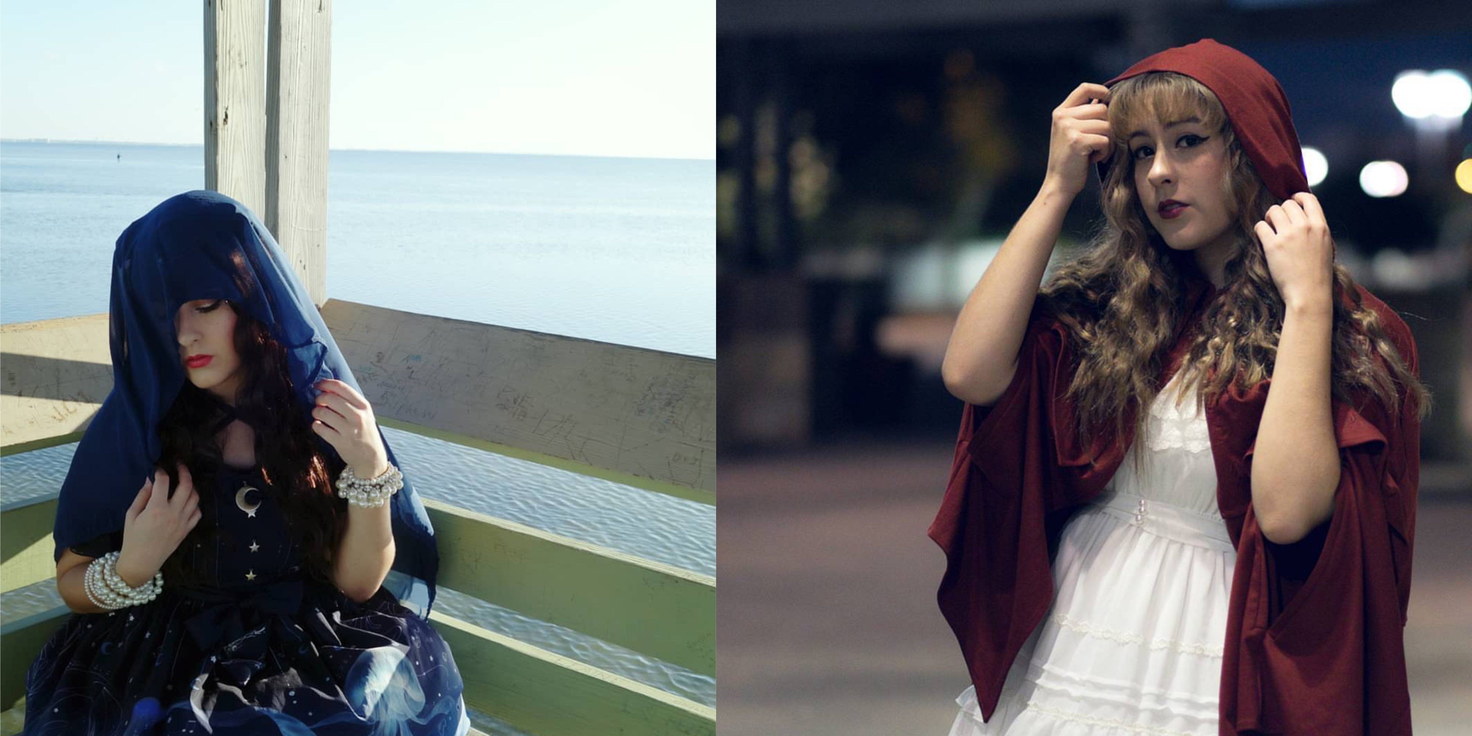
My first posing critiques post got a lot more traction than I thought it would, actually. It makes me happy that you guys are enjoying my posing series, and I really hope that it’s helping you learn some little subtleties to help you guys be happier with your coord shots and portraits in general.
Before we get started on part II, I’d like to note that I’m not critiquing coords or photographs, just poses. Everyone starts somewhere, and everyone is capable of some sort of self improvement. As always, I’d like to offer a huge thank you to all of you who were brave enough to get a public critique like this—it takes a lot!
This time, I did something slightly different. I like the idea of critiquing poses of people as a whole (after looking at their Instagram, for example) and choosing a photo that either shows those things that are common issues in their posing or issues that I’ve noticed are common in the community. Sometimes, I choose photos that are great examples of things I’ve talked about before. If the volunteer doesn’t give me free reign over their Instagram account, I just critique their pose as normal.
Elsie Seastrand
Elsie Seastrand
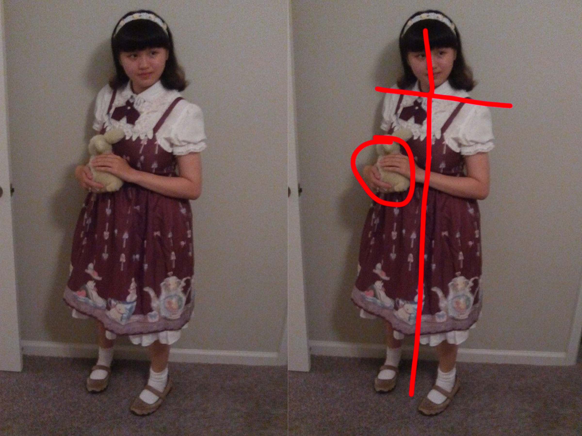
What I really like here is that Elise’s not flat to the camera, and I love her interaction with the stuffed animal! There’s great separation between her arm and her waistline that doesn’t look awkward or forced, and I love the angle between her shoulders and her head. Her head tilt also looks very flattering as well.
The energy she gives off overall is very soft and feminine, which plays into her personality and lolita style very well. However, her softness does border on shyness. Even though she is pretty confident, it still seems like she’s hiding a bit, and I think this is partially due to the way she is turned, and that the stuffed animal is facing away from the camera.
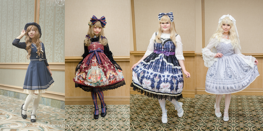
I’d like to suggest that Elise flip the stuffed rabbit around so we can see its face and hold it delicately with one hand. Her fingers are a bit stiff here (and fingers are difficult to pose!). To fix that stiffness, relax your hand at your side, then lift your wrist up and put your hand on the bun. It should look a bit more natural after that! Another option is that she only cradle the bun in one hand, like she’s doing with her right hand in the photos above; in this case, I’d like to see her other hand lift her skirt up and out just slightly for a more traditional lolita pose. I’d also like to change her leg position from a pigeon toe to another pose like the one below (sorry it’s hard to describe!):
Susan Ly Johnson, Sakurako Hoshina, Candy Henderson, Ann Nguyen
@melzjelly
@melzjelly | Photo by @_georgeglass_
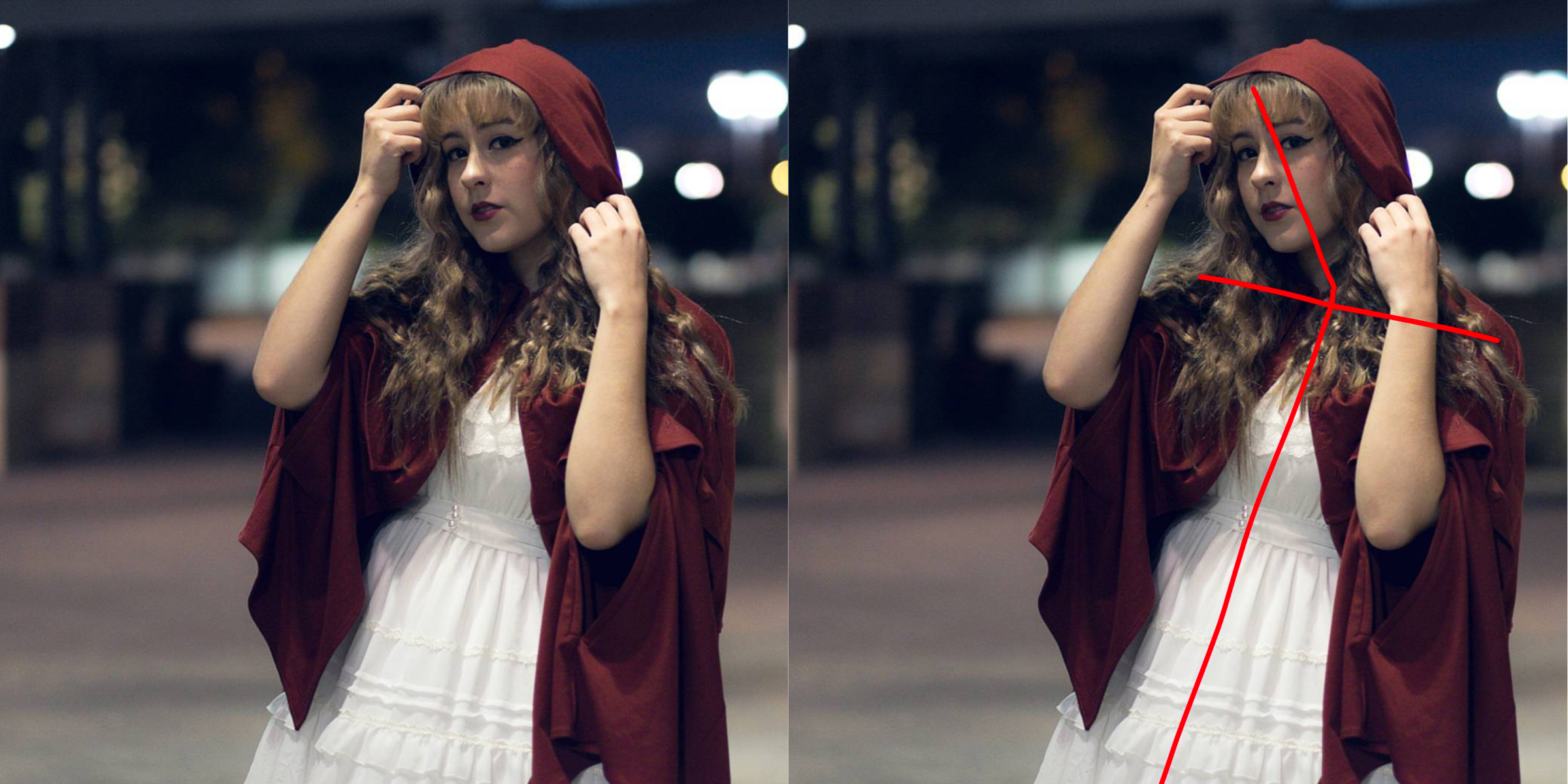
To start off, I love her arm angles here. The way her forearms don’t create a straight line with her wrists—while at the same time keeping softness and not looking broken—is definitely the sort of thing you should be thinking about! The other angles she makes are pleasing as well, like her shoulder and torso and head tilt.
The biggest issue that I see here is that her head angle makes it looks like she’s crouching to stay in frame, which can make anyone look much less confident. In this image in particular, it looks a bit strange to me, since the photographer should accommodate the model’s height instead of the other way around (except in certain cases).
I have run across this issue with my self portraiture quite often. I’m not sure if this photo was a self portrait or not, but let’s assume that this was for a moment. If you’re taking photos of yourself and your tripod is too short, or if your lens is too long and you can’t change the pitch of your tripod, you can fix the issue without crouching by bending your knees or widening your stance to stay in frame. If you can, try widening your stance first, as this ends up with the most natural-looking end result.
One last thing: whenever I take photos of people looking off frame, I like to get their eyes illuminated just a little bit. Whenever the model’s eyes catch the light, there’s a reflection we call a “catchlight” in photographyland. Catchlights are used to bring a little bit more life and soul into the model and helps prevent a dark, deadeye look that can tend to happen with overhead lights a lot, such as here. Simply raise your chin just slightly to get a bit of a catchlight, and it would bring more of a focus to your eyes.
Ann Nguyen (@ribanns)
Ann Nguyen
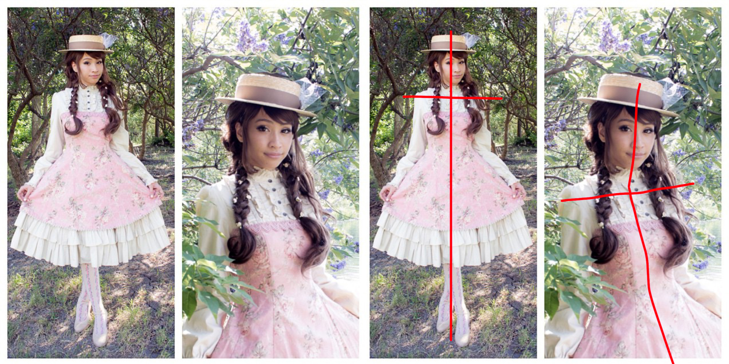
After hunting for a while on her Instagram, I decided on this photo because it’s a good example of how posing guidelines aren’t rules for everyone to follow rigidly. Here, Ann poses straight to the camera. Look at how her spine and her shoulders make a perfect cross. I would caution against this type of pose with most people, but it’s really flattering on Ann. And even when she’s standing so flat to the front, she doesn’t lose her angles in her arms, skirt, or face; the energy in the photo doesn’t fall flat; and the eye has somewhere to go: that is, straight down. Combined with the energy in her face, this eye movement lets the viewer see her entire coord as they look at the image. These are good lines.
In general, especially in this light, Ann’s skintone on her face is pretty similar to that of her neck, which can tend to cause her to lose separation between her face and neck. To fix it, I’d ask her to lift her chin up slightly. I would also caution against crossing her legs this far; it doesn’t look bad, but I do think that having her legs side-by-side with a slight bend to one knee—or pointing one foot at an angle and letting her back angle be a little straighter so she doesn’t break the line of her legs— would look even better.
In general, I’d like to see Ann embrace more angles in her photos such as the photo on the right. It’s a super flattering angle that is really quick and easy for a short coord detail shot.
Collin Quinlan (@admiral.wolf)
Collin Quinlan
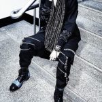
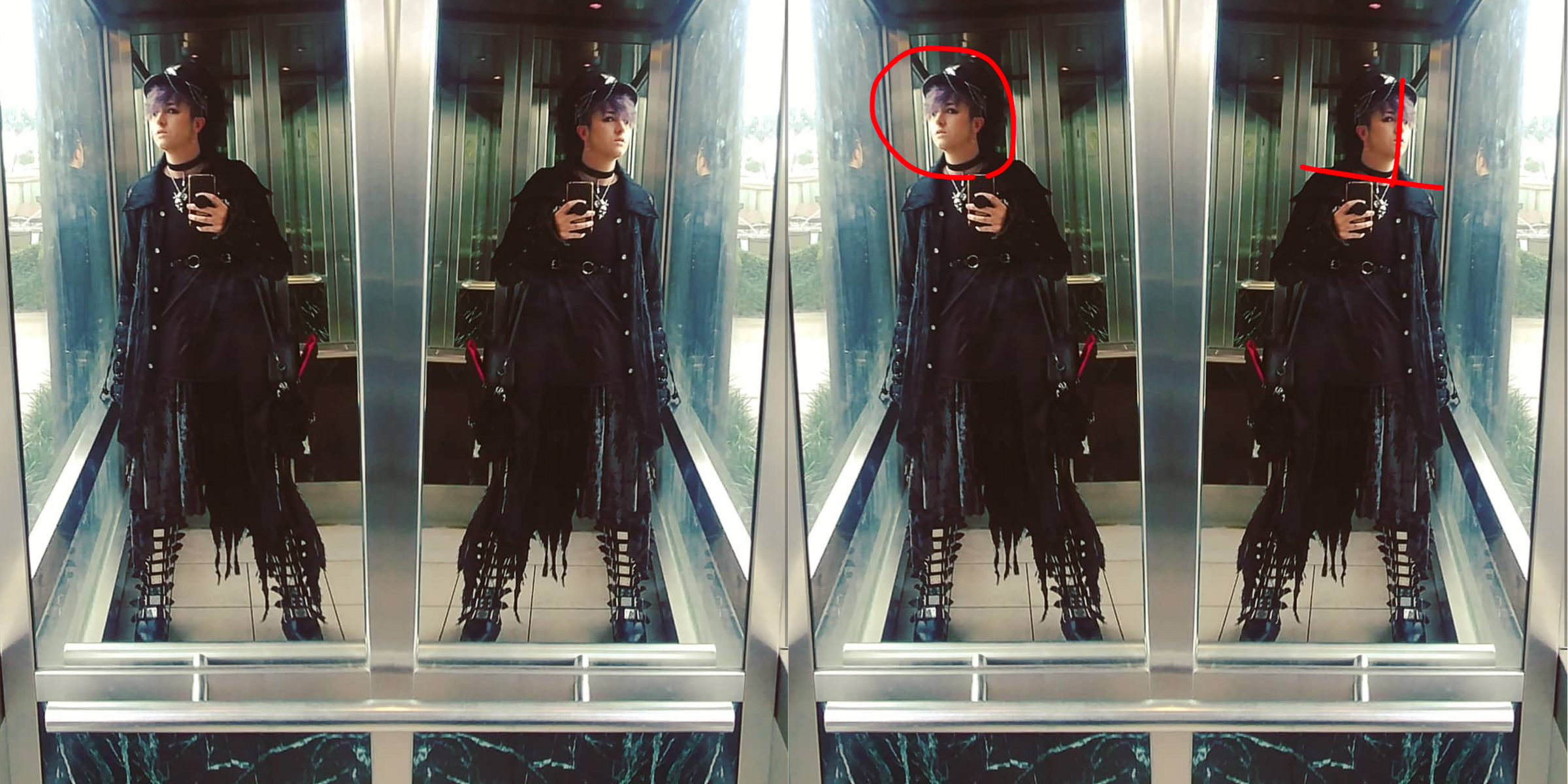
This pose is quite an effortless one, as most masculine poses are. His shoulders are at an angle (that is, not flat horizontal), and neither are his hips, which adds visual interest. His weight is also a bit off center, which helps create interesting angles and energy in the photo, even if you can’t really trace Collin’s hipline through all those clothes. His legs are relaxed and are set a little bit wider than shoulder width apart, which lends a bit of a power stance. This goes very well with the style he’s posing in—and those shoes.
Note that he’s doing the masculine head tilt, where his head is following the angle of his shoulders and not tilting against it (more on that here). However, Collin’s chin is a bit too high here. For him, especially in this light, the current angle makes his face look a lot rounder, and therefore much, much younger. You lose his sense of intimidation that he usually has in his personal style. I’m not sure if that was his intention in this photo. If not, the fix is simple: move your chin down a lot and out slightly more, and find an angle where the light emphasizes your cheekbones (to combat round faceness). Personally, if it were me posing, I would also tilt my head slightly more as I lower my chin, to make it look a bit more natural.
Fixing the chin angle would also help the viewer’s vision path in the photo. When I first lay my eyes on this, my eyes are drawn to his shoes and bag. The look is, quite simply put, bad*ss. But when my eyes move upward in the photo to find his face, I’m a bit sad that he looks so much younger and about the conflict of style this creates. He can fix this not only by moving his chin down, but by leaning forward very slightly at the waist to prevent his top half from looking so small (and therefore bringing more attention to his top half vs the shoes).
@breebree150
@breebree150
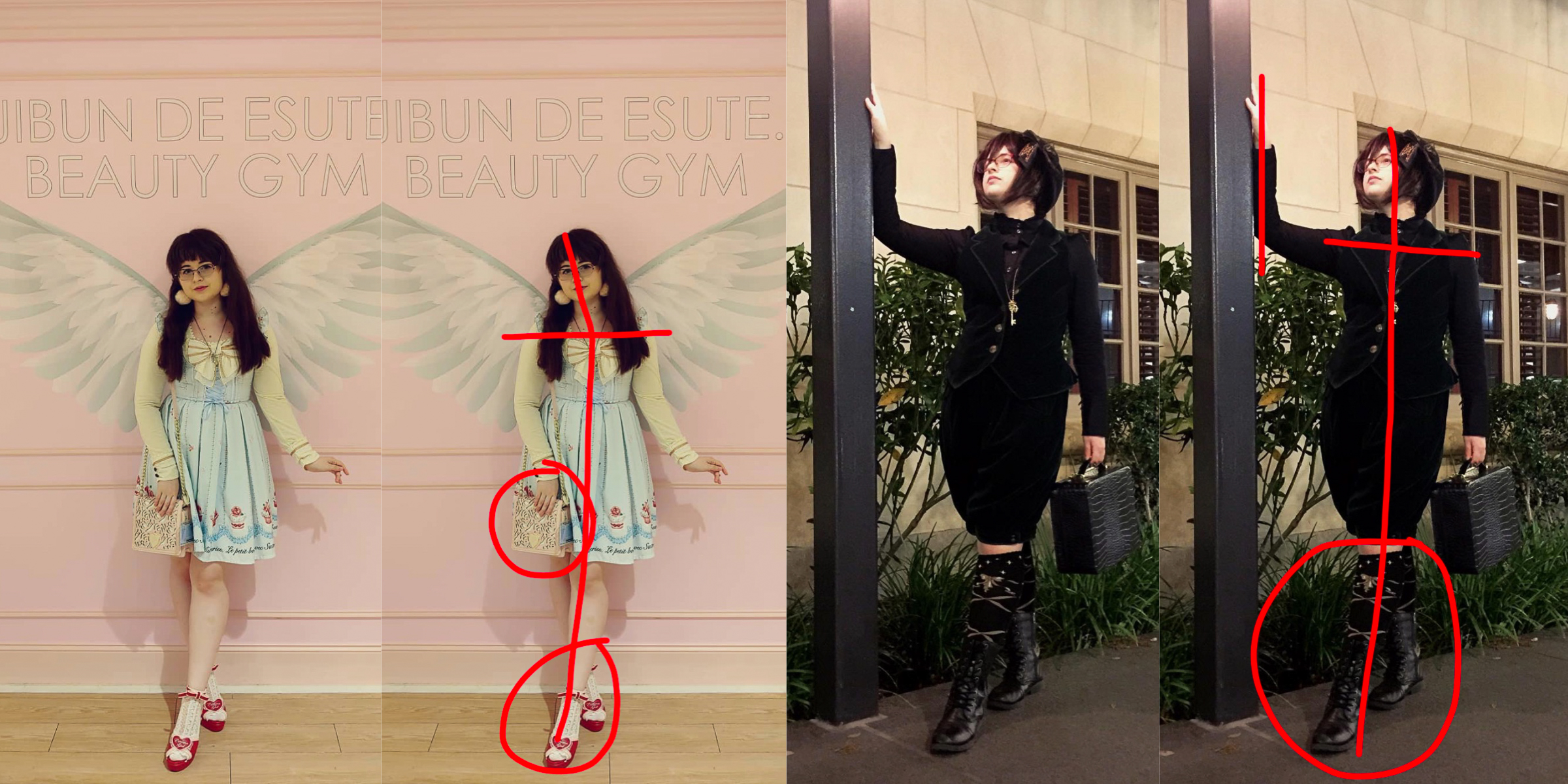
Here’s a little bit of a different one. I decided to choose these looks to show the difference in masculine and feminine posing, and how one person can achieve both. Let’s start with feminine.
In the image on the left, I absolutely love Bree’s head angle. Because it’s so pleasing with her hair, the fact that her shoulders are almost horizontal doesn’t really bother me. Her hair makes enough angles for her! She creates separation between her arms and waist really effectively, and this is very flattering, and the angles of her arms are as well. Even though her chin is downward, she maintains a long neck, seemingly without trying, which can be difficult depending on whatever your body type is. My top tips for this photo: her bag is crinkling her skirt (just pull the bag away from the skirt, let the skirt fall back into place, and then replace the bag), and her back foot is hiding slightly behin her front foot. The latter isn’t much of an issue until you realize that her back leg is 1 in the shadow, 2 tucked far behind her front leg, and 3 is a similar color to the background, making it blend in a bit—and we almost lose it. So just be aware of that. I would also tell her to relax her wrists just a bit, and they both look a tiny bit forced into harsher angles, but that’s pretty minor.
In her ouji photo, she does a really good job of posing in a masculine way. Between her hands, shoulders, head tilt, hunch, and head and chin angles, she has this down pat. Her neck once again is effortlessly long, and I personally think this pose is pretty darn creative. Still, I do have some comments. To start, while slouching is more masculine, it’s quite casual. Rolling her shoulders back would do her well here, I think, and help to bring back some of the proportions she’s lost because of the dark colors and the angle the photographer was shooting from. As always, I’d also recommend to bend toward the camera at the waist slightly, though that’s minor here.
About her legs: crossed legs like this are very feminine, and in her ouji photo it really stands out to me as the most feminine thing about her. If that’s what you want, that’s fine, but if you’re looking for more of a masculine ouji vs feminine ouji, I’d suggest that you take your front leg and move it to the opposite side of your back leg, trailing it out behind you as if you’re casually floating towards your lady (or in this case, the lamppost).
Paulina P (@cupcake_kamisama)
Paulina P
When Paulina messaged me, she mentioned that she’s been reading my posing posts for a while, and that all that information gets a bit overwhelming. It’s important to remember that my posing tips are not law and they might not even work for someone at all—hell, other photographers might (and probably do) strongly disagree with the tips I post. This series is also written under the assumption that people won’t read everything in one post, let alone every single post. Because I know it’s a bit overwhelming, I will be coming out with an index at the very end of the series with links to every single posing post, so that you only have to bookmark one page and so you don’t feel rushed to remember everything all at once.
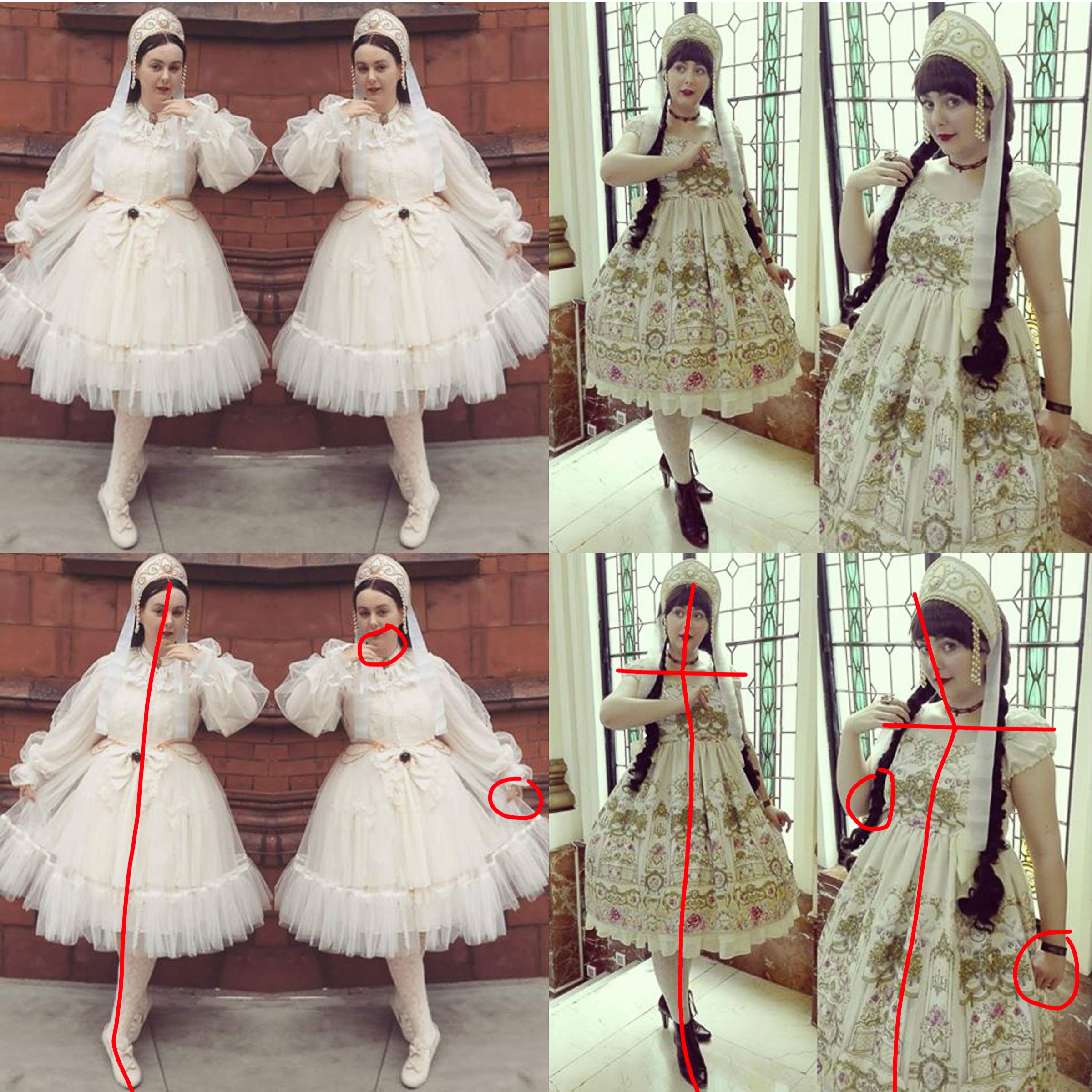
Based on what I’ve seen in Paulina’s Instagram account, and how she’s progressing as a model, I can tell that she’s been taking posing seriously. She is aware of her angles and of how the camera will view her, and she’s detail oriented in both her coords and in her poses—which is great! She’s especially conscious about her head angles and tilts. For her, I have some tiny critiques and one big one. Let’s start with the tiny ones.
Looking through her Instagram account, she has a tendency to cross her legs so that one foot is hidden behind the other. To fix, she can simply point her toe along the line of her leg (like in later photos—I think you might have realized this recently and started to fix it) and pull her back leg out (away from the center of your body) a little. Also, Paulina, be very aware of how your hands are posed. They can sometimes come across as pretty stiff or awkward, like the circled hand on the photo on the right. Also, be aware of how your arms lie on your body, whether you want a gap between them and your torso or not. Finally, in front-on photos, make sure that you push your chin out and then turn your nose to one side (eg. look off to one side very slightly) to create more emphasis on your jawline and create that separation between your face and neck.
The biggest way that she can improve is to relax a bit—she’s pretty stiff. I believe that one of the culprits of this stiffness is that she takes her posing almost too seriously. She’s thinking “How can I make a great pose that’s interesting” versus “What is tried and true and screams ‘me’?” It’s a common issue that arises when you start to recognize how you can improve your posing, and results in people taking things a bit too literally, and a bit too much to heart. As an example, I can tell she’s thinking about being confident in her poses, but she overshoots that and they become stiff and slightly awkward. This is easy to do, and I’m guilty of it as well. In her case, I would suggest to sit down and make a collage or layout of her favorite recent photos, then really take a look and see what’s working and what looks forced. It should look effortlessly beautiful. Draw lines on the photos, and see where lines are being broken by stray feet, what the shoulder line really looks like, etc. It’s much easier to dial back on something than to try to get yourself to be “more.” My biggest tip for you is to slow down and make sure you’re still having fun when you pose. I know this is rather general, but I do hope it helps.
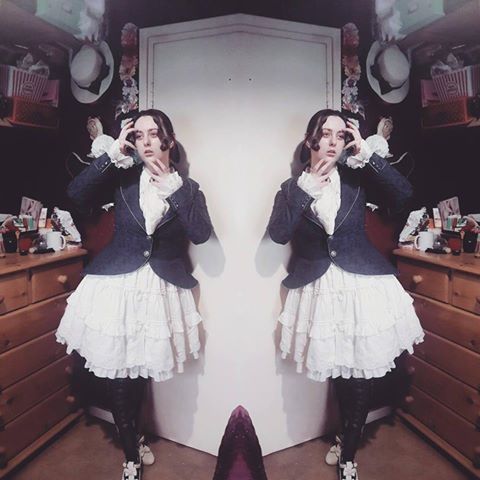
As an extension of this, Paulina asked me specifically for tips for taking photos in small spaces, like this outfit shot here.
Paulina P
Notice the purple thing in the middle? That’s her bed.
One of the things I would say to do is something she’s already doing: using a reflection effect to minimize the bed in the middle. I’ve done this several times, when there’s something in my photo that I can’t take out. Another option is to take more closeup shots. Getting details in your coord can be both pretty and fun.
Another alternative to those is to embrace the issue Bob Ross style. There’s no mistakes, just happy accidents. That bed that frustrates you? Embrace it, and use it either in your photo or to hold something, like your bag. Make it intentionally part of your photo instead of trying to fight it.
As an aside, I really like your pose here. Your hands might be stiff, but they’re purposefully so, and I find it very interesting! You’re doing that hiding thing with your legs again though.
And that’s a wrap! Thank you for reading this Posing Critiques post. I know it was long!
If you want to be a part of this, you can message me at Lightningsavage Photography via any social media and pick my brain. You can even stay anonymous if you like.
Thank you again, and I’m looking forward to the next posing article!
Kal from Lightningsavage Photography specializes in creative portrait photography for J-Fashion enthusiasts and more. He has served as the J-Fashion event photographer for Oni-Con 2016–2020, as well as fashion shows, meetups, and personal shoots. He is also a co-owner of Kuroshiro Kawaii. You can follow him on Instagram at @lightningsavage_photography and @kaldec_
He is currently into visual kei and EGA fashions.


