Posing Critiques
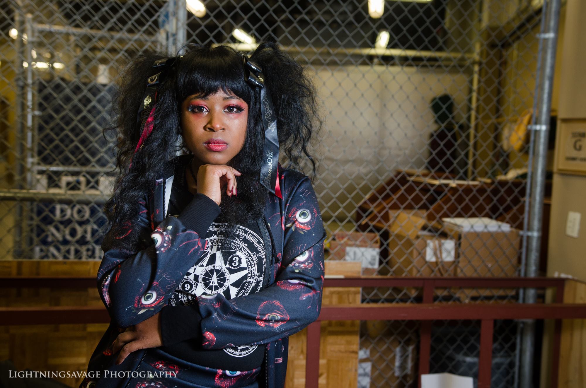
Hey, all! Now that the Individual Posing Series is complete, I was able to reach out on Facebook for a little audience participation. The following models volunteered their photos for posing critique based on the advice I gave in my posing series so far.
It’s important to note that I am critiquing poses only, not photography/photographers or coordinations. This is meant to be constructive for the volunteers and for everyone else reading, not to bring negativity into the community. I have tried to use my own photographs where possible, even if I directed the shoot/pose previously, to show that there’s no such thing as a completely perfect pose. I can sit there and tweak a pose until my model falls asleep, and I would still most likely want to change something later down the line. We all grow, we all learn, and nobody’s perfect.
That said, I want to thank each and every volunteer for their bravery and willingness to improve themselves and be a constructive example to others! It takes a lot to submit yourselves publicly, and this has been something I’ve been wanting to do for a year or two, inspired most recently by Lovely Lor’s Fixing Your Coordinates series.
I had such a response that this will be broken into multiple posts to prevent it from getting too terribly long!
So, without further delay, let’s dive into it.
@bunny.butts (IG)
@bunny.butts
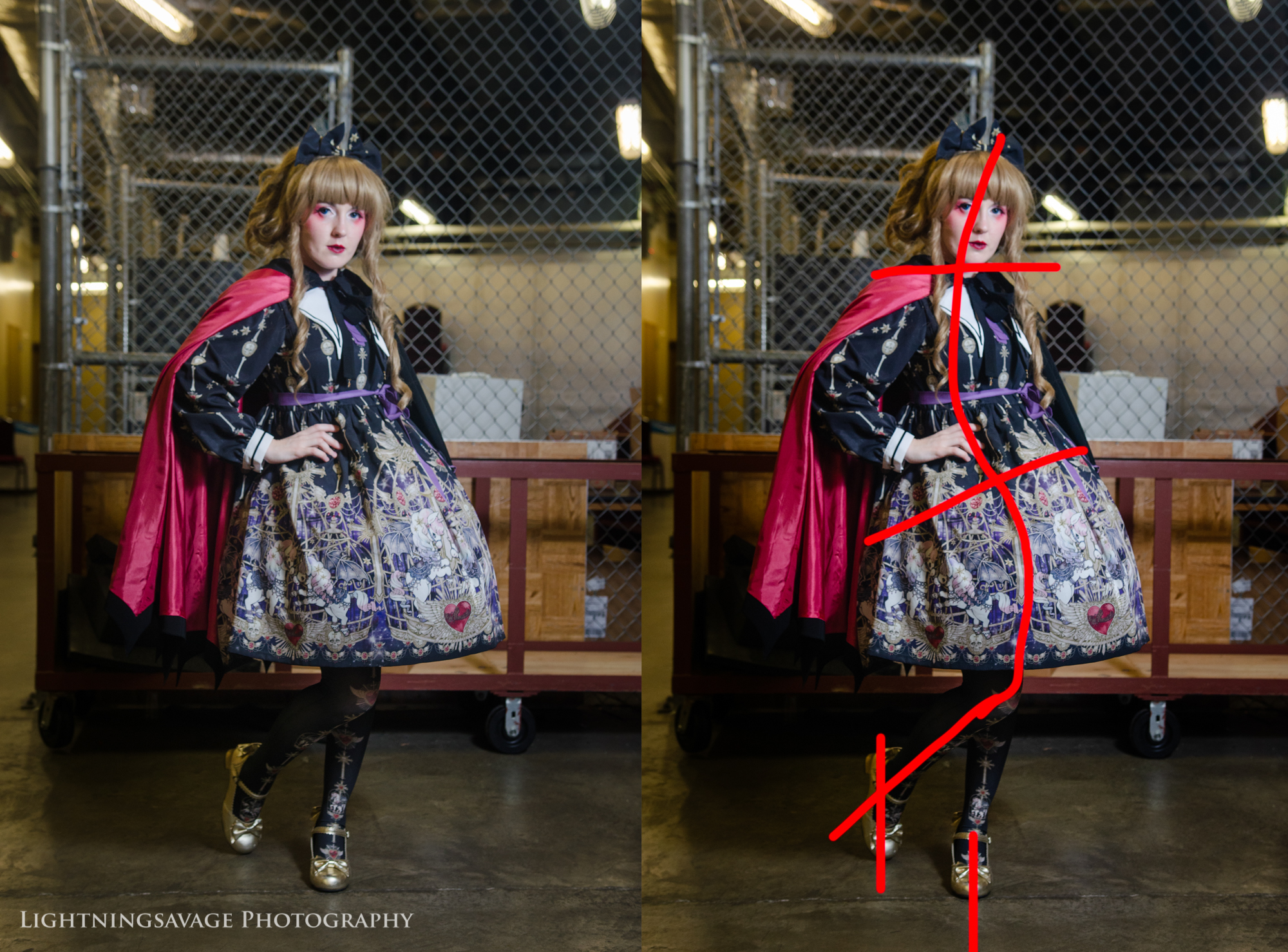
At first glance, I love the way bunny.butts is leaning back at just the right amount, with her cape thrown back (such a creative idea!). Her body is at an agreeable angle to the camera, which keeps her proportions. For this photo, I was shooting from below her waist, so she leaned toward my camera slightly to fix any proportion issues that might arise. Her leg and arms positions are still good, and don’t break the line she creates with her body. Kudos!
One of her concerns was that the pose, combined with the petticoat poof, makes her stomach look bigger than it is. A way to fix this is to not necessarily lean forward—that could lead to a hunch—but instead focus on pushing your hips back and into less of a ‘tucked’ forward position. You can see how tucked forward they are by how much the red hip line is slanted. When you push your hips back (versus sticking your butt out), you might feel it like a stretch in your back. This means you’re doing it right!
If I could pose her again, I would bring up her chin just a little, and turn her nose towards the light as well. This prevents strange shadows from falling on her face, and allows us to see a true profile of her face (and a bit more of her jawline). At risk of nitpicking, I would scoot the back foot of her toe back just a smidge, and the toe of her other foot to her left, to help continue the line of her leg, and help to avoid any parallel lines created by her feet.
Also, I know she was going for a serious Snape-inspired look so smiling is not too much of an option, but I feel like a gentle smirk could be fun. 😉
Kristina Elle (@cybr.grl)
Kristina Elle | Photo by Meci J Photography
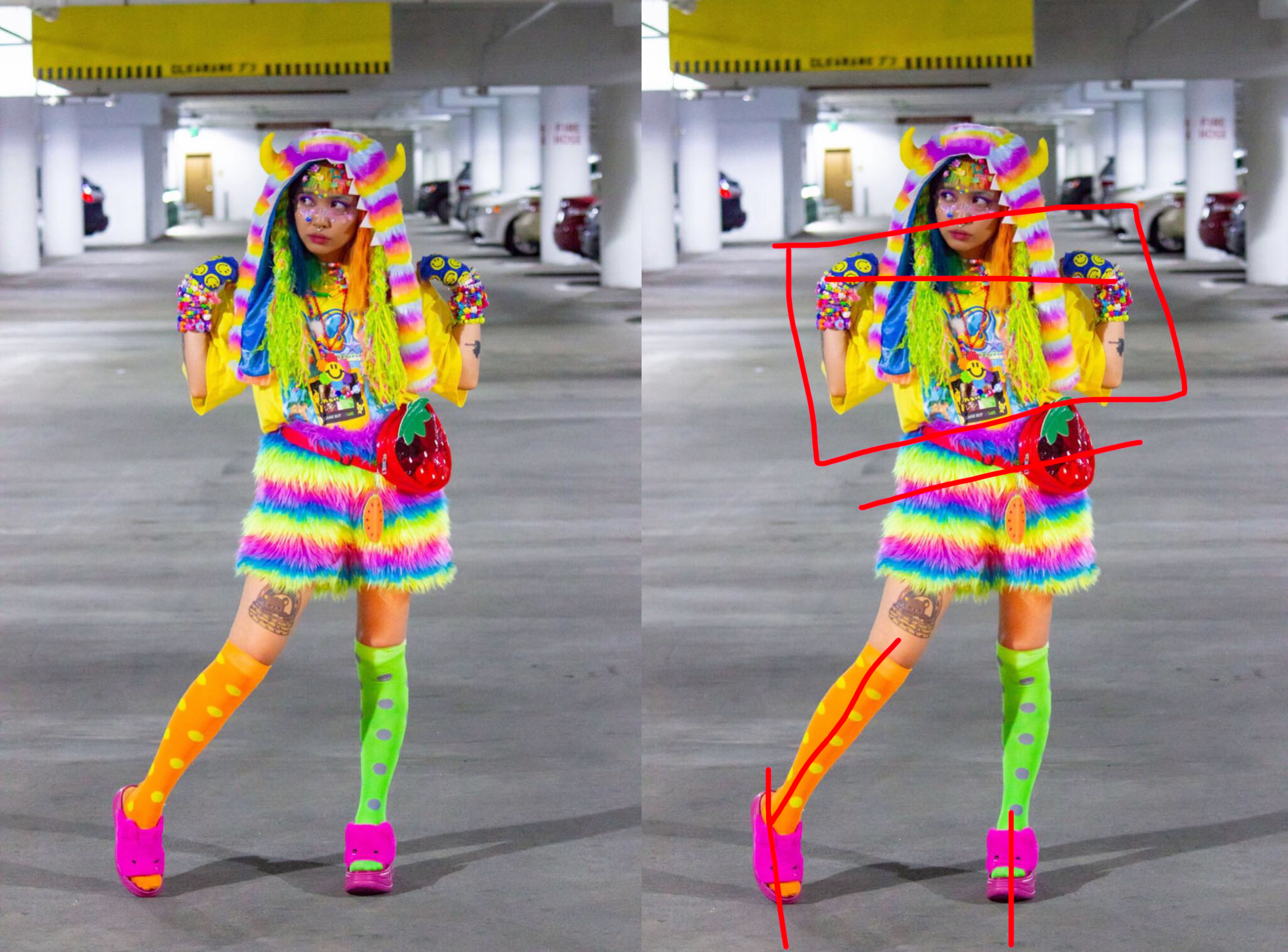
First off, this pose isn’t as weird as Kristina made it sound when she sent it to me! She’s doing a good job shifting her weight to balance out the fluff on her shorts to not make it look awkward. I love her head tilt, the hip tilt, and all the lines she creates.
The biggest concrit I can give for this pose is that when hands are parallel next to the face like this, it can tend to look a little top heavy. Also, because there’s so much going on up top, the viewer’s eye almost skips over her torso and head and hovers around her hips/feet. You lose the detail of her coord in your chest/shirt/arms area, especially for a bright and busy fashion like this. To fix this, I’d recommend dropping her left hand down and out, floating it to make a pleasing angle that complements the line she created with her leg. Also, lift the other elbow up just slightly to create more space between her glove and the hat. Space helps call attention to fuzziness without being unbalanced.
Speaking of space, Kristina asked me specifically for tips on how to pose better in an empty space with nothing to use as a prop, lean on, or hold on to. Personally, I’m a big advocate of empty space in a photo, because it can help you make a bigger impact. In this photo it’s really not that bad! The biggest thing I can tell you is that you’re confident, but you’re not really taking up the empty space that’s given to you (mainly because of your arms). Don’t think of it as an empty space with no props—instead, think of it as a stage you’re there to perform on.
Also, a fairly minor nitpick: your green foot is flat front to the camera, and you can’t see the detail of the shoe. It doesn’t bother me much though, because this coord is so out there and striking. Why shouldn’t your pose be too?
Amye Cortiaus (@princess_honey_bun)
Amye Cortiaus
Like a lot of people in this series, Amye gave me free reign on her Instagram. Is that a good idea or a mistake? Haha.
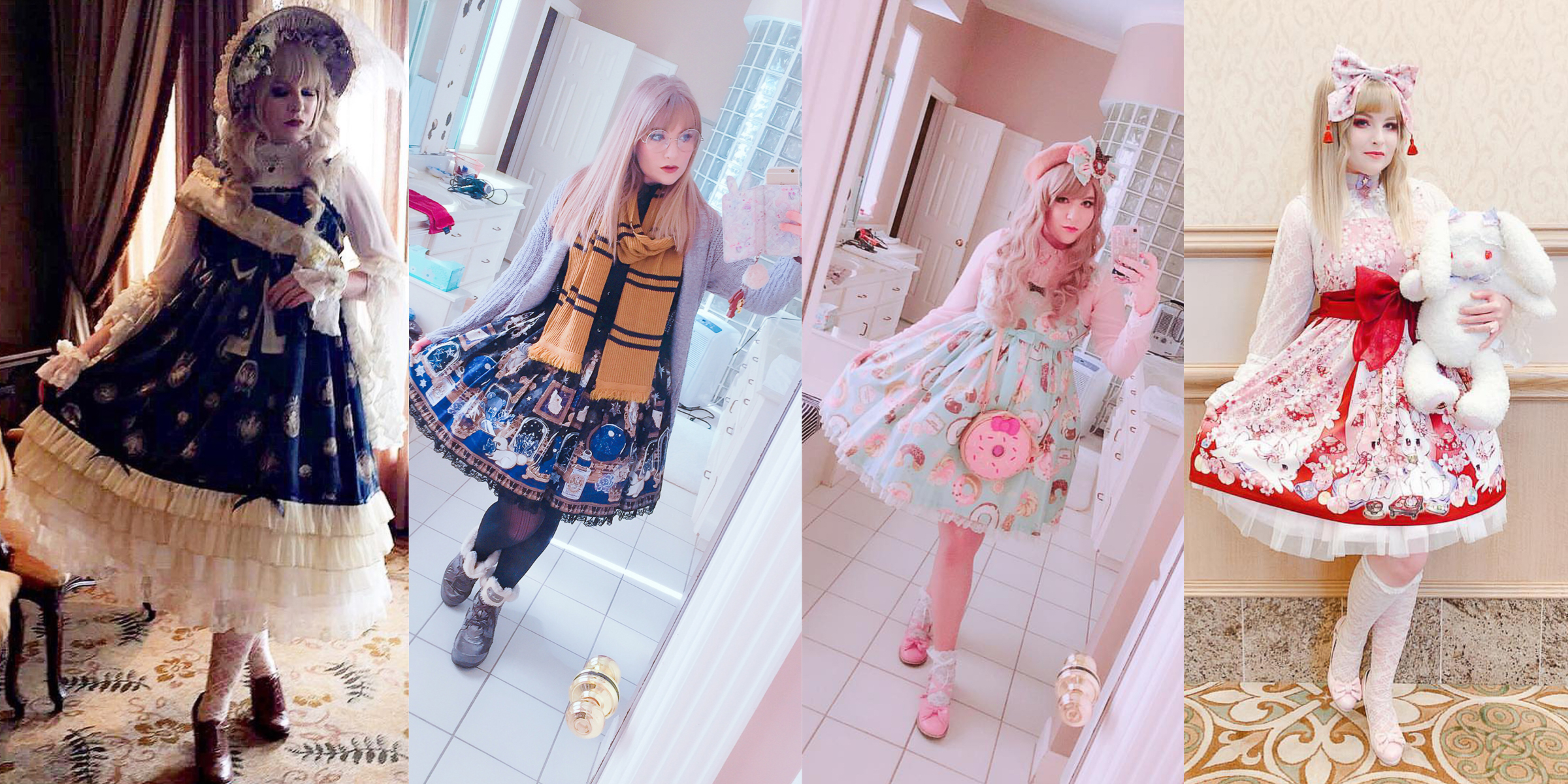
I chose a few photos for some very specific reasons. Most of them have nearly the same pose—it’s her signature pose, and it looks great! I love how she holds her feet, legs, and head in the center two images specifically. She knows which angles look best on her face, and she knows how to use them.
I do have a small tweak on her signature pose, and then a few comments on the image on the left. The tweak? Whenever you pull your skirt, pop out your elbow away from your body just slightly enough to create a bit of space without looking awkward—just like she did in the photo on the right. Wearing outerwear will change this rule, so just play around with how it looks in the mirror until you find a poppage level that works with your JSK, cardigan, or high-waisted OP.
Speaking of high-waisted dresses, these can be a bit tricky to pose in, which is why I’m picking on the image on the left a bit. Her pose is great—I just have some tweaks.
This dress is super high waisted. Dresses like these tend to swallow your torso and make the wearer a bit out of proportion. In this photo, a good fix would be to just lean forward at the waist in the direction of the camera slightly, even if it means bending at a slightly awkward angle. I would also tell her to pick her chin up slightly so that we can see more of her neck through the high collar she’s wearing, and to make sure her front foot doesn’t break the line of her leg. Easy!
Candy Henderson (@meltyberryqueen)
Candy Henderson
Another Instagram victim!
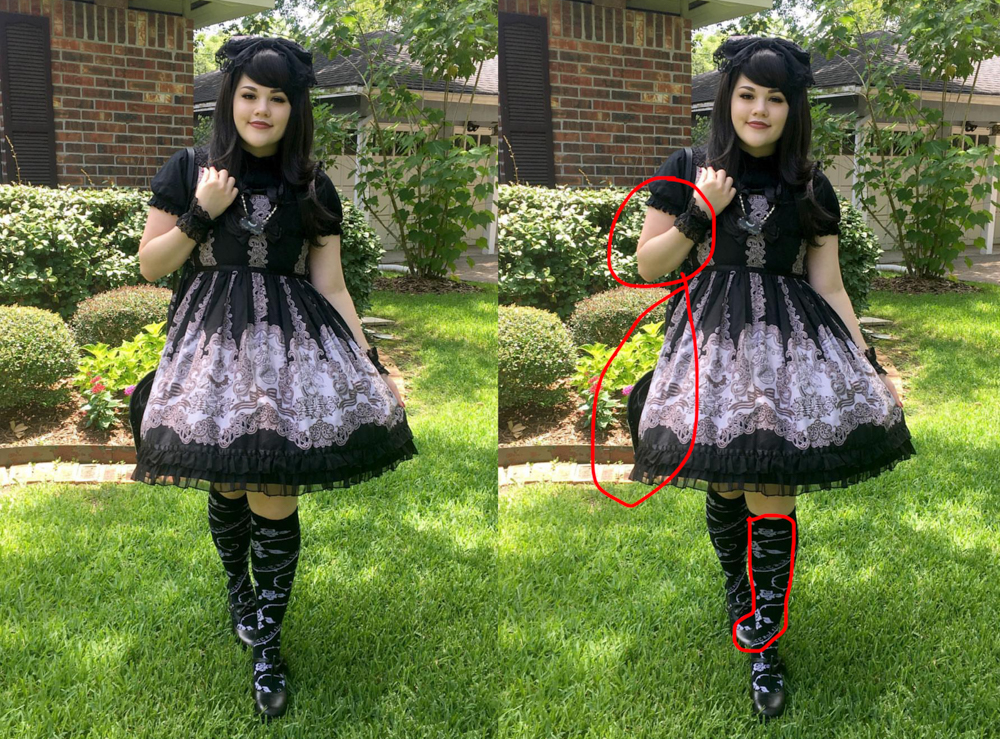
To start off, I’d like to mention that Candy wears lolita nearly every day (or did at the time this was taken), so I know this wasn’t a carefully posed shot—and believe me, there’s nothing wrong with that! I’m going to critique it accordingly.
I love the amount and way Candy’s pulling her skirt. That can be a little tricky to pull off correctly, but looking through her Instagram I’ve noticed that she’s pretty consistent. Her arms are also not symmetrical, which I think works well in this case. Based on her other photos, I can tell that she’s been reading my blog! Her chin is out, but perhaps a bit too much. I think she can safely bring it in juuuust slightly. Just a tiny bit. Juuust a little.
As a whole, I’d like to see her a bit more confident, with more angles. Twist to the left just a bit to be less flat to the front and create those angles. It’s a quick fix that makes a huge difference! Also, like Amye, I’d like to see her bump out her elbow away from her body a tiny, tiny bit, just to create a little bit of separation between her dress and her elbow. Combine that with her right arm (it looks a bit timid at the moment—to fix it, bring your elbow away from your body just a small amount and forward toward the camera) and it would make a world of difference in this photo specifically.
I’d also like to see the bag! As it is right now, it’s completely hidden and presses down your petticoat awkwardly. Simply move it in front of you to fix, so it’s not so noticeable when it presses your petti down, as bags do.
Something else I’d like to point out is your foot position here. I’m not sure why, but your leg position combined with your OTK pattern creates the illusion of a third foot?? This is not something you could have possibly known or fixed, of course, I just find it a bit silly, and to be honest I can’t unsee it. 🙂
Sally Asbury (@sugarcoatedwitchling)
Sally Asbury
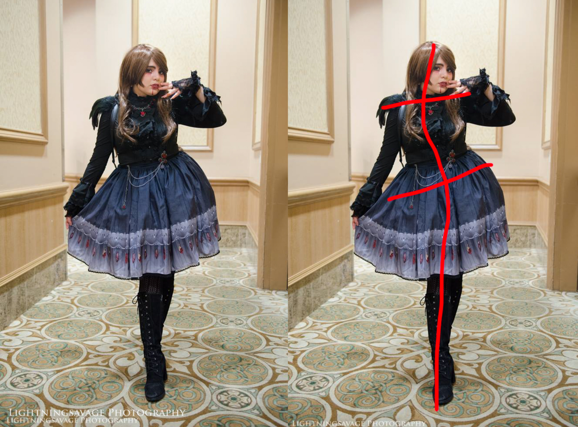
This is a great example of posing for brands, which I’ll get into later. But let’s pretend it is a simple coord shot for now!
I’ve shown this photo before in a posing article about what I call missing limb syndrome—in other words, when you pose in such a way that it looks like you’re missing an arm or a leg! As I mentioned previously, I don’t really mind it in this photo since it goes along with the bird theme a bit (in fact, I think I’d like it less if she had two distinct legs), but I thought I’d point it out for those newcomers. Ordinarily, if this happens to you, you can fix it by moving your back leg either to your lefs or to your right, depending on how much of a cross you want in your legs.
Now, to the concrit!
I really like how much she’s tugging your skirt. A lot of people tug too hard and it distorts the print, but I feel like people are becoming better about it as the years go by. She’s also leaning forward at the waist, which makes her look really tall and proportionate, while making your legs look long at the same time (also those boots!!). She’s not just leaning forward, but leaning to the side as well. I really like the look that creates. Note the S-curve that Sally makes as she does this, emphasizing her curves and the curve of the petticoat. It’s a very flattering angle, and it avoids any lines parallel to the horizon line, even though Sally’s facing the camera front on.
The one thing that I’d tweak about this photo is her face. She look timid and scared, specifically in her eyebrows, almost like she’s drawing your eyebrows together. It clashes a bit with this dramatic pose, which I do like, but perhaps there’s not enough energy in her face to keep they eye there. Mine is constantly drawn towards her skirt and legs instead of her face. I’m a bit undecided.
Harley Maldonado (@princeharlequin)
Harley Maldonado | Photo by Lauren
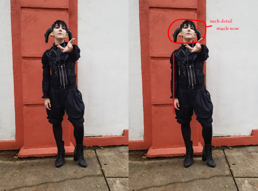
Something that Harley’s always good at is making good use of 3D space—that is, all three axes: X, Y, and Z. His arm is outstretched, and this throws his hand out of proportion (but I quite like it in this instance, since his coord is rather dramatic). It is important to note that he’s taken care to avoid covering up his coord and his face with his arm. This takes quite a bit of model-photographer communication to do. In addition, his shoulders, hips, legs, and feet are also well placed, something that I personally have issues with (but he always seems to get right)!
My concrit revolves around his midsection and head. To start with, he’s accidentally hidden the most detailed part of his coord, where his best strengths lie, and the part we all want to see: his headpiece, makeup, and neckline. I’d move his chin down slightly so we can see more of his horns and of his eye makeup (and eyes!). His face, like mine, is one that works best for a chin up pose, but this is slightly too much. Bending forward at the waist will also help with his chin angles, and to keep his face from disappearing into nothingness—and that’s where most of his detailing is! When you pose, try your best to highlight your strengths.
As far as his midsection goes, it almost looks like his torso is shorter than what the vest was made for, which is (let’s face it) a very common problem with vests and corsets. If he leans forward as I suggested, this will get even more pronounced. In this instance, what he can do to fix it is to think about elongating his spine by pushing his belly button up, and thinking really hard about touching his belly button to the back of his spine behind his solar plexus. Note that this is not the same as ‘sucking in’ and does not accomplish the same result.
Fun fact: I used to be in marching band, and we did this technique as we marched to create separation between our upper and lower bodies, so we could play and march at the same time. It did this by elongating and aligning our vertebrae, getting us to hold a proper posture. This elongation (coupled with tightening our cores) enabled us to absorb more shock in that buffer zone. In posing, this elongation physically makes you slightly taller by temporarily fighing the gravity that weighs down and collapses our spines, if that makes sense. You are literally holding yourself up with muscle instead of bones. It makes you look taller, more confident—and it will also help relieve back pain!
Harley’s right arm is also just lying at his side. I’d like to see it bent ever so slightly in some way so it can take up more space in the frame and be more active in the shot (in other words, provide more energy using angles). If I were posing this shot, I would also have him turn a bit less than 20 degrees towards his left, so we can see the light hit his vest and blouse more. I have a feeling there’s more detail in this coord than we can see in this photo, and I’m really curious about it. 🙂
Edit: I just realized right before I posted this that he’s wearing demon scleras!! I want to see them!
Katie Morrow (@katseeingstars)
Katie Morrow
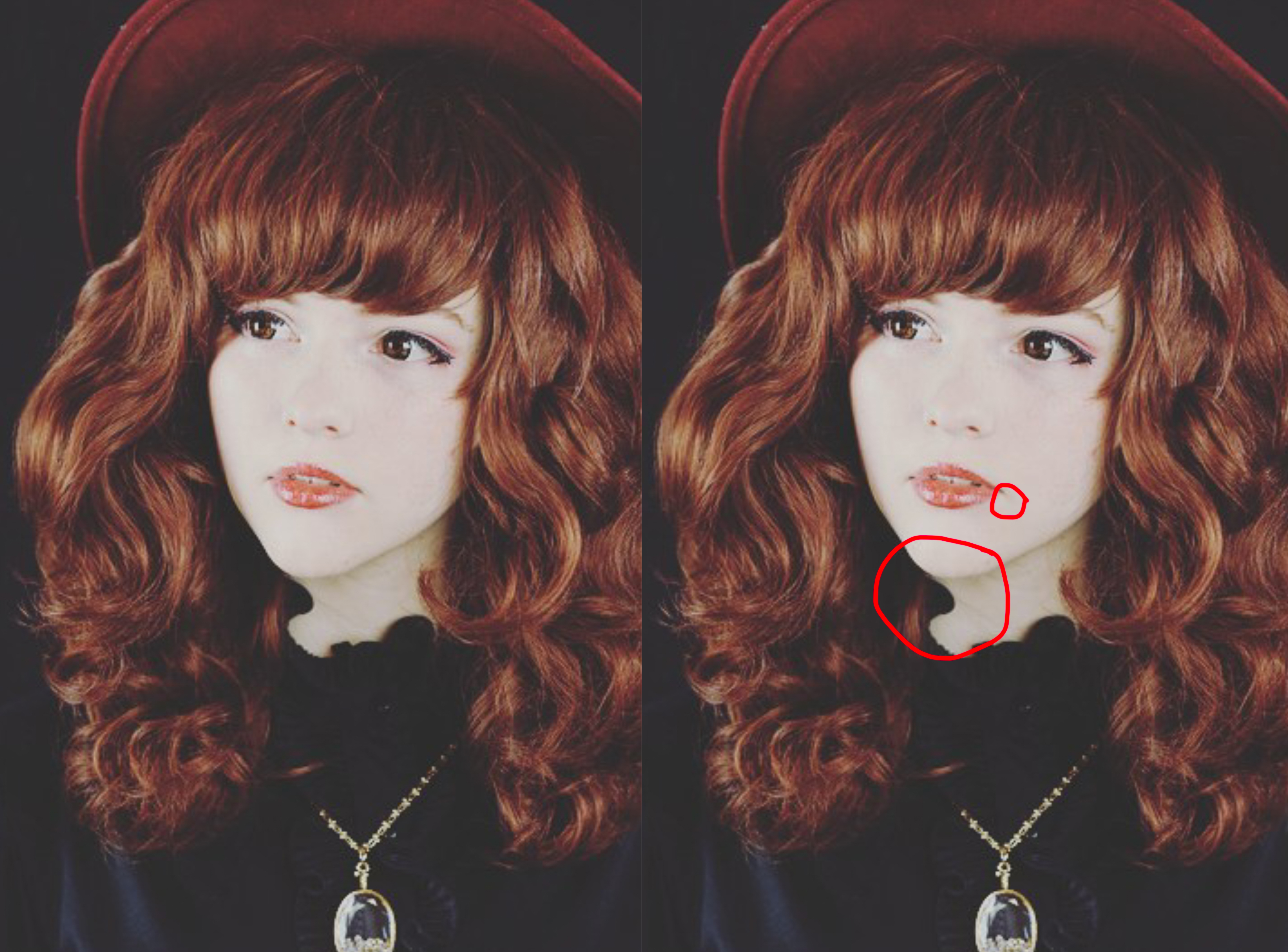
Katie also gave me free reign on her Instagram, so I chose a type of pose that no one submitted yet: a closeup. Especially after just posting a closeup posing tips post, I thought I’d dive into this a bit. It’s important to note that this photo was taken waaay before my article as well.
I honestly love this pose. Looking though your photos on Instagram, I noticed that I liked your older poses much more than your newer ones. Maybe it’s because you’ve become less selective as time goes on, or not trying as hard, or not having posing help, or if you’ve just had a priority switch—all of those are ok (and expected), I just thought I’d point it out.
For this photo, I wouldn’t change much, so let’s get to nitpicking.
First off, I’d like to congratulate her on finding her head tilt, head pivot, nose direction, and shoulder angles. I love how they are in this photo, and if you don’t memorize this and use it in more of your photos, I’m going to come after you.
Her chin and neck are well separated, but there’s something that still bothers me about her neckline. Her blouse has a standing collar that’s really wavy, and one of the waves matches the line of her chin. Because it’s such a low-key photo, her blouse merges in with the back of her hair, and thus the little wave in her collar almost looks like she’s missing a part of her neck! Photography can be strange sometimes. 🙂
I also can’t help but notice that her mouth has a bit of a frown. I really enjoy the relaxed-lip look in this photo, but the way the light hits you makes you look like she’s frowning a bit more than she actually is. I feel like the overall look could benefit from just the slightest upturn in the corners of her mouth. And we’re talking very slight—just tighten the smile muscles in the corners of her mouth, and don’t think about actually smiling. This will help counteract the accidental frown and bring her expression back to relaxed and neutral.
She has a natural smize in most of her photos, but I found that it’s not quite there in this one. While it doesn’t necessarily need it, I’d suggest smizing just slightly to help bring more energy into her eyes, and to look up just the tiniest amount so that the light will catch more of her eyes as well. This will help balance the change in her mouth above as well as bring more energy into your face and into the photo. And we’re talking very, very slight changes here—almost too small to notice. But if done correctly, they will make a difference in how much the human eye takes interest in her face and in the photo itself.
Thank you, all, for your submissions! I hope these critiques helped and weren’t too harsh. If you have a question, DM me on social media and I will do my best to answer. Posing is sometimes something that you have to mess around with in person, but I did my best.
I have a part II to this post, since I got so many responses, and I think I’d like to keep this going if the demand is high enough. If you want to be critiqued, find me on Facebook, Instagram, or Twitter and DM me a photo where you’d like your pose critiqued, your name, and how you’d like to be credited as the model.
Stay tuned for part II, and thanks again!
Kal from Lightningsavage Photography specializes in creative portrait photography for J-Fashion enthusiasts and more. He has served as the J-Fashion event photographer for Oni-Con 2016–2020, as well as fashion shows, meetups, and personal shoots. He is also a co-owner of Kuroshiro Kawaii. You can follow him on Instagram at @lightningsavage_photography and @kaldec_
He is currently into visual kei and EGA fashions.


